Book covers and book illustration
Tori Amos - Little Earthquakes animated album cover (2025)
This animation is a personal project, and is a reimagining of Tori Amos’s album cover for ‘Little Earthquakes’. I’ve animated mushrooms onto the original album cover, first the stinkhorns on the back, and then I added a different images of Tori’s face to the front cover, adding in extra mushrooms.

Pride Month promotional character illustration (2024)
This was a commission from author Frances M Thompson, author of LGBTQIA+ books such as Hummingbird and Let Love Rule. Frances wanted a celebratory series of character art to use for promotional use during Pride Month.
I draw couples and throuples from Frances’s books, everyone celebrating Pride and displaying flags and emblems of their often intersectional identities. Each image was delivered as a transparent PNG to enable them to be used across different backgrounds, and easily placed into designs in programmes such as Canva, to easily create social and website assets.
This was a fantastic project and I really enjoyed bringing her characters to light.


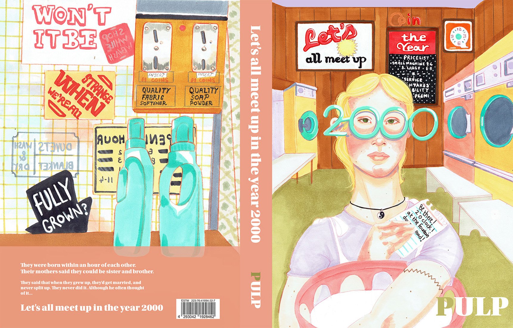
Let’s all Meet up in the Year 2000 book cover (2023)
My most recent work, Let’s all Meet up in the Year 2000, was a MATS Bootcamp course brief to design a book cover with hand drawn typography based on significant dates in our lives. I chose 2000, and got the idea to reimagine Pulp’s song ‘Disco 2000’ as a novel.
I’d already doodled elements like the 2000 novelty glasses, wanted to include them somehow, and thought it would be fun if the the song lyrics were embedded in the background of the laundrette. I love antiques and vintage posters, so this was very fun to illustrate. I mistakenly thought this song’s music video was set in a laundrette, but it wasn’t, but by then I was exited about the retro colour choices, typography possibilities, and the wonderfully mundane setting for a novel, which seemed very much in the spirit of a Pulp song.
The final cover was retweeted by Pulp musician, Nick Banks.


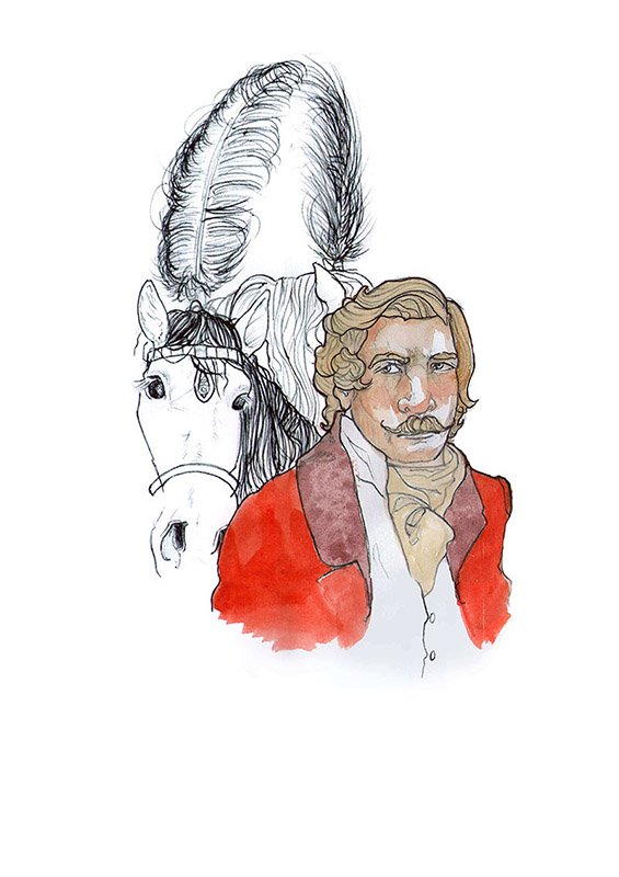
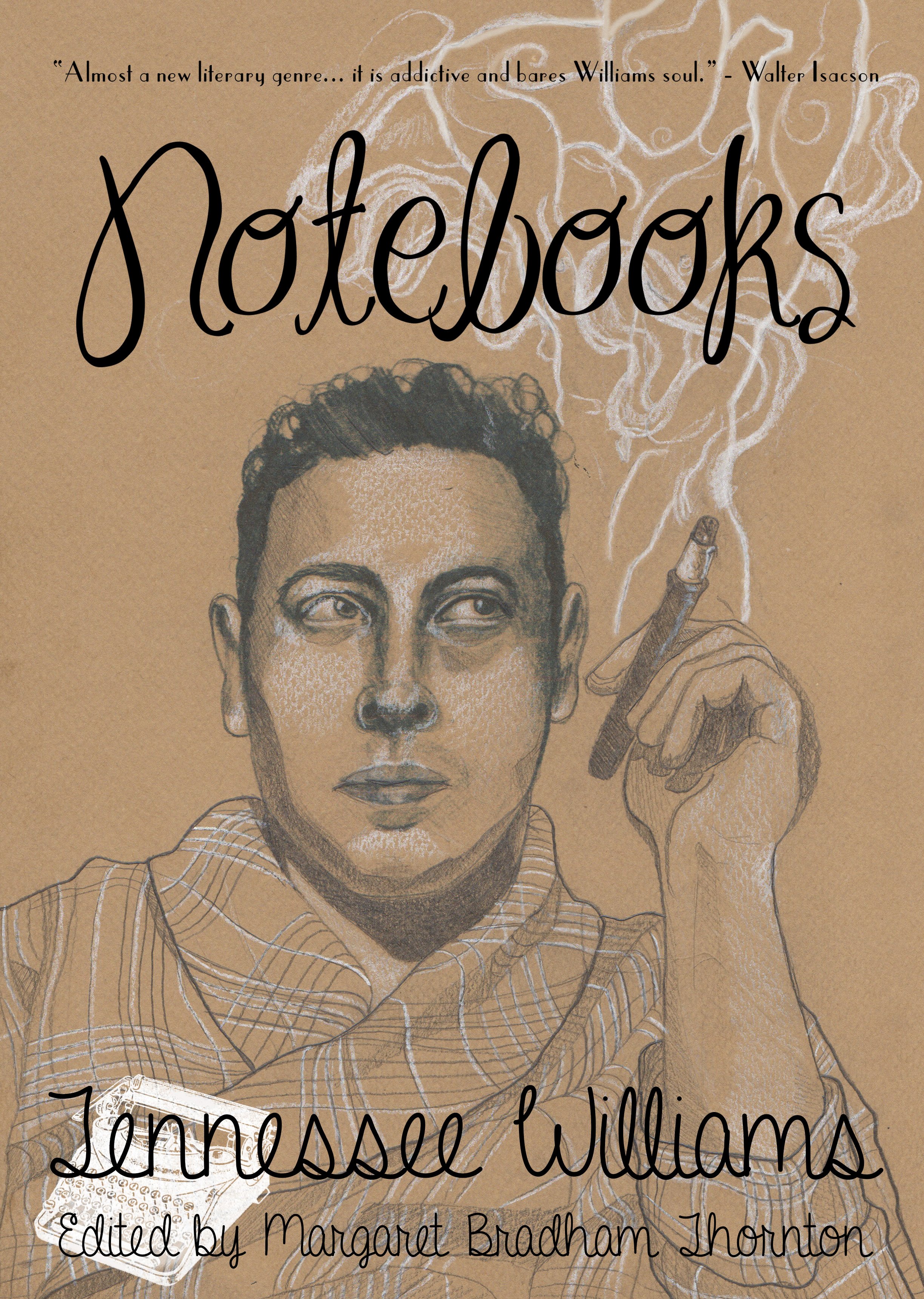
Tennessee Williams book covers: Cat on a Hot Tin Roof and other plays, and Memoirs.
Tennessee Williams is one of my favourite authors, and as he’s sadly deceased but not yet out of copyright, there are very few nice book covers on his work. I illustrated two front covers based on my knowledge of the texts. These are predominantly basic pencil on coloured paper, finished digitally.
For the Cat on a Hot Tin Roof book, I took care to show how conflicted the protagonist, Brick, feels about his wife, Maggie, and his football team colleague, Skipper, that he may or not be in love with. I read him as bisexual, and because Williams himself was gay, I think it’s highly likely he was intended to be read that way. I depicted Maggie, here in the background, wearing the homemade hat she made to cheer on her husband’s football team. She is not a well liked character, and I think people forget how in love with her husband she is- to be in public in a big goofy homemade hat. It shows the complexity of her character.

A New Topography of the Durham Coalfield
For this non-fiction book I created illustrations for the inside of the book, designed and illustrated the introductory page, and illustrated and designed the endpapers.
I drew the smaller illustrations live at the Wakefield Coal Museum. It was challenging but I really enjoyed it. For some artefacts, you can make an appointment to see them one by one, and they’re brought carefully to your table. As they’re important artefacts, you can’t photograph them, so I was taken along to draw them! It was exciting to see each piece brought out, and having 30 minutes each to get a good likeness of an object. I love the fact that you’ll only ever see them as illustrations.
I would love to do a project like this again- I love museums and non-fiction.


Teeth of a Lock and the Art of Losing
This is my own book of short stories that I designed and published print on demand. I illustrated many of the stories and gave them title pages. Although the drawings are recognisably in my usual style, I used ballpoint pen and watercolours rather than marker pens. This is because I wanted them to feel whimsical with a vintage feel.